Case Study for Website Redesign
|
Background
Medicare is a type of insurance which becomes available once a person turns 65 years old or has a disability. Medicare transition is the process when people change from their current commercial insurance or non-insurance options to Medicare. Problem Statement The transition to Medicare is a daunting process, and members need as much support and education as they can get to select the best plans. However, Florida Medicare’s Medicare transition lacks easy navigation to Medicare education, resources, and services which can help potential Medicare members select the best plan for their finances and health. Many of Florida Medicare’s commercial insurance members are choosing competitors when it comes time to transition to Medicare. Solution: Medicare Education Site In this case study, we explore one of the concept solutions in improving the Medicare transition experience, which is a Medicare Education site. The Medicare Education site redesigns the navigation, information architecture, and style of the current Medicare site to lessen confusion and to include additional customer service features which support current and potential Medicare members. As a UX Researcher & Designer on this project, I designed and prototyped the lo-fi and mid-fi redesigned website. The outcome of my work guided the design direction to the design team in how to redesign the Medicare education experience. Disclaimer. Due to NDA and client confidentiality, the client's name has been removed from this project and will be generically called "Florida Medicare". By request of the company, team member names have been abbreviated as well. Any related branding and logos have been similarly removed and certain graphics are unable to be shared under NDA and client confidentiality. |
Duration
November 2021 - February 2022 Role UX Researcher & UX Designer Team 1 Director of Product Development and Innovation, 1 Business Lead, 1 UX Design Lead, and 1 UX Research Lead Tools AdobeXD, UserZoom.com, Microsoft Suite Skills Information Architecture, Wireframing, Prototyping, Usability Testing, Web Accessibility Evaluation, Qualitative and Quantitative Research Synthesis |
CHALLENGE
How might we improve the Medicare transition experience
so that more people choose Florida Medicare as their insurance provider?
so that more people choose Florida Medicare as their insurance provider?
Organized. Supportive. Flexible.
|
The Florida Medicare experience of the past was confusing to navigate and understand with unclear information architecture, overcomplicated content, too many bright colors, and a lacking channel to knowledgeable advisors.
The redesigned Florida Medicare site addresses these issues, improves the learnability of Medicare, and sets the tone for a positive Medicare experience. |

|
Before Redesign
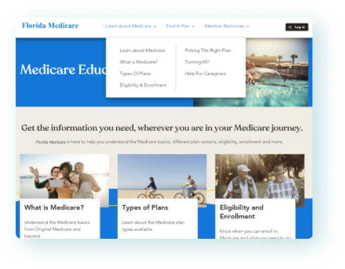
|
|
|
After Redesign
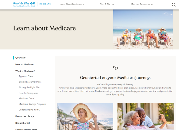
|
|
The Innovation Team's process.
Identified opportunities & challenges.
Identified opportunities & challenges.
RESEARCH
|
01. The Innovation Team's Process.
The Florida Medicare process is to discover, validate, then realize opportunities. This ensures a lower-cost investment in experimentation and an opportunity to quickly and iteratively explore ideas before committing to a solution. The Innovation Team comes into play once the Customer Experience Team has identified the discovery insights, opportunities, and challenges. For this project, my work on the Innovation Team focused on conducting research to validate the initial research in the VALIDATION stage. After I completed the market research and accessibility evaluation, I supported the next step of testing the research by designing the prototypes for the Medicare Education microsite, conducting usability tests, and compiling the validation research insights. 02. Opportunities & Challenges. The opportunities and challenges were identified by the Customer Experience Team during the Discovery stage. As part of our Innovation Team work, I completed research, design, and usability testing focused on the Education opportunity. GUIDANCE. We have an opportunity to help members find the Medicare plan best suited for their cost and health needs. RELATIONSHIP BUILDING. Improving the member-and-insurance relationship with age-under-65 members will improve the likelihood of members transitioning to Florida Medicare. EDUCATION. Members are currently lacking easily digestible information and a trusted advisor to answer any of their questions. CONSISTENCY. Members are confused by the inconsistent terms in navigation labels and in the explanations of plans, costs, and services. |
I used the Opportunities & Challenges identified by the Customer Experience Team as a foundation for my evaluation of the existing Florida Medicare site's online experience. I also took the initiative to conduct an accessibility evaluation, using design principles, visual observations, and my accessible design knowledge.
Accessible design considerations for members around age 65 with
visual and/or cognitive disabilities.
visual and/or cognitive disabilities.
ACCESSIBILITY EVALUATION
|
Accessibility is particularly crucial in this project because our customers are members around age 65 or past age 65. With this age group, more visual and cognitive disabilities may be present. To validate the opportunities and challenges identified by the Customer Experience team and to highlight any other customer pains, I initiated an accessibility evaluation.
For the accessibility evaluation, I explored the main Medicare Education page, as well as drilling down into pages about plans and costs. The Discovery research done already highlighted information and navigation as major issues. I kept these major issues in mind as I analyzed additional aspects of the site which would be challenging for members with visual and/or cognitive disabilities. At this time, a WCAG-EM report wasn't done to analyze the website's accessibility according to the WCAG 2.1 AA standards, but given the opportunity to do this project again, I would create that report. |

|
What's Going Well
What Could Be Improved
|
The issues later experienced by users during usability testing confirm some of the issues observed in the accessibility evaluation, especially those in regards to text, colors, content readability, hierarchy, navigation, and different ways of receiving support.
One of the concept solutions to emerge from the research and accessibility evaluation was the Medicare Education Microsite.
This Medicare-specific hub would provide the educational resources and personal guidance which members felt they didn't have. This microsite would include visual redesign of the old Medicare site as well as new features, such as direct appointment scheduling with a Florida Medicare Trusted Advisor.
This Medicare-specific hub would provide the educational resources and personal guidance which members felt they didn't have. This microsite would include visual redesign of the old Medicare site as well as new features, such as direct appointment scheduling with a Florida Medicare Trusted Advisor.
Redesigning the Medicare Education microsite.
Based on research and the accessibility evaluation.
Based on research and the accessibility evaluation.
DESIGN ITERATIONS
|
Improving the Medicare Microsite
Information Architecture. To improve the ease of navigation, a left navigation bar is included in the Medicare microsite, allowing users to easily view where they are in relation to other Medicare topics and to easily navigate to another topic. Digestible Content Chunks. Content was reorganized under headings to make each section more distinct. This should help members not only in navigating the site but in understanding the relationships between Medicare-related information. Accessible visual styles. The color palette and images used adhere to the Florida Medicare brand style guide. However, instead of using the brighter toned colors in combination with the thinner font weights, more neutral/muted colors with enough contrast between text and background were used. Diverse representation. The new Florida Medicare Education microsite includes photos of a diverse variety of ages and ethnicities who represent Florida Medicare's population in hopes of making stronger connections with our valued members. Two redesigns were created to test the user reception towards using stock images (representative of Medicare patients), tiles, and accordions, an A and B design were created. Both redesigns include the necessary changes to improve the Medicare Education site experience. |

** Due to NDA, the original AdobeXD prototype can't be shared. This screen is a Figma recreation, showing a sample of the left navigation bar and structured content.
|
The two redesigns are ready to be tested with the target member audience.
Unmoderated A/B testing between the baseline and redesigned Medicare microsite.
CONCEPT TESTING
|
Usability Testing
Revised Testing Instructions I revised the unmoderated testing setup: task format, post-task questionnaires, and post-test questionnaire. In my revision, I wanted to ensure that all the necessary probing questions were asked and that the users would have a good testing experience. Baseline Microsite vs A&B Redesigned Prototypes Two UserZoom unmoderated tests were setup: a baseline test and an A/B test. Both UserZoom tests were setup with the capabilities to record videos and create transcripts. Both the baseline and redesigns were tested using the same tasks. The redesigns also included additional questions asking for visual design feedback. |
|
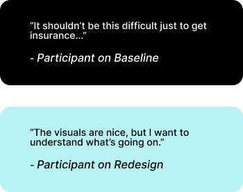
Testing Results
Qualitative Feedback
|
|
|
Quantitative Feedback
|
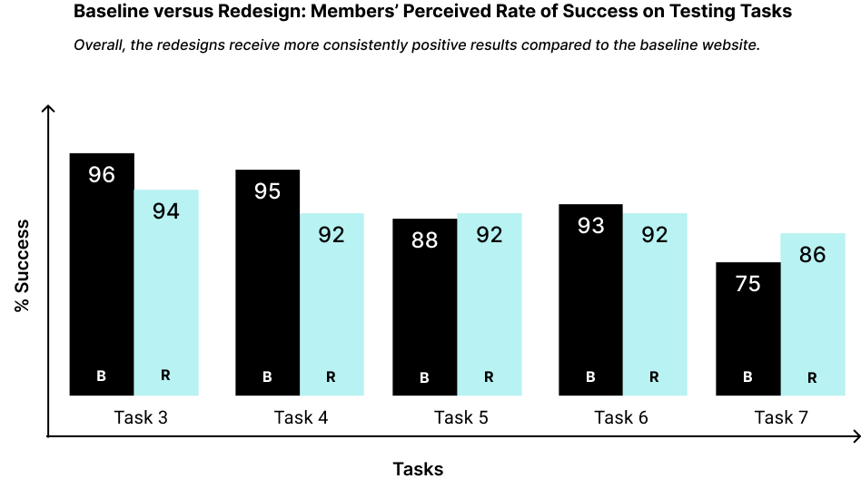
|
** Tasks 1 and 2 aren't included in the chart because their activities involved submitting their opinion, not task success.
|
Testing Tasks
** Due to NDA, the testing scenarios have been summarized. Task 1: Prioritize topics from Most Important to Least Important when it comes to preparing for a Medicare plan. Task 2: Prioritize topics from Very Easy to Very Difficult when it comes to understanding Medicare. Task 3: Navigate to where you would go to get a better understanding of Medicare programs. |
Task 4: Navigate to where you would go to understand what Medicare does and does not cover. Task 5: Navigate to where you would locate information to help you understand what Medicare premiums you'll have to cover. Task 6: Navigate to where you would access the requirements to enroll in a Medicare health insurance plan. Task 7: Navigate to where you could download a guide to further your understanding of the Medicare program. |
The redesigned microsite received
more successful and positive results
than the baseline website.
more successful and positive results
than the baseline website.
RESEARCH TAKEAWAYS
How might we improve the Medicare transition experience
so that more people choose Florida Medicare as their insurance provider?
so that more people choose Florida Medicare as their insurance provider?
01 A bad transition experience is
a preview to a bad member experience.
Potential members who struggle to learn about Medicare through
Florida Medicare’s website have decreased trust and communication
with Florida Medicare.
a preview to a bad member experience.
Potential members who struggle to learn about Medicare through
Florida Medicare’s website have decreased trust and communication
with Florida Medicare.
02 Members need to know Medicare is
flexible and personalized to their needs.
Potential members desired resources and support to help them
determine the best plan, tailored to their specific budgets
and health needs.
flexible and personalized to their needs.
Potential members desired resources and support to help them
determine the best plan, tailored to their specific budgets
and health needs.
03 Structured and organized Medicare
content increases learnability and confidence.
Medicare content is more approachable when the content is structured
and consistent vocabulary for Medicare terms are used. Potential
members can more easily build their mental model of understanding
Medicare, which builds their Medicare transition confidence.
FUTURE WORK
More than a website, a Medicare transition experience.
More than a website, a Medicare transition experience.
01 Multiple ways for 1:1 support.
Provide potential members multiple ways of navigating Medicare
education and accessing 1:1 support, including but not limited to
knowledgeable advisors and different information channels
(in person, phone calls, video calls, contact forms, emails, flyers).
Provide potential members multiple ways of navigating Medicare
education and accessing 1:1 support, including but not limited to
knowledgeable advisors and different information channels
(in person, phone calls, video calls, contact forms, emails, flyers).
02 Search functionality.
Provide potential members with a search functionality, which
filters out irrelevant results.
Provide potential members with a search functionality, which
filters out irrelevant results.
03 Lessen cognitive load.
Use language which is on par with potential members’ understanding
of Medicare and insurance. Use key term specificity and consistency
across navigation, content, and headings. Improve content readability,
and link related content together.
Use language which is on par with potential members’ understanding
of Medicare and insurance. Use key term specificity and consistency
across navigation, content, and headings. Improve content readability,
and link related content together.
LESSONS LEARNED
My personal takeaways.
Important for providing the best testing experience for future users
& aligning research insights with design improvements.
Important for providing the best testing experience for future users
& aligning research insights with design improvements.
|
01 Creating a good usability testing experience.
1. Beyond learning how to use UserZoom, I also learned how to frame questions and instructions to be more readable. 2. In the future, I’d shorten the test questions, especially for older adult participants. Having too many questions is tiring, and some questions can be repetitive. 3. For a better testing experience, I’d recommend conducting a pilot test to estimate the time and effort needed. 02 Reconciling qualitative and quantitative results.
1. The qualitative responses drew out many frustrations for participants. However, many participants still marked the tasks as “Easy”. 2. At first, I was confused why the Baseline still received positive perceived task success completion rates above 90%, but I later realized the inconsistencies of the performance. I also saw through some recordings how participants downplayed their difficulties when reporting them in the follow-up questions. |
LET'S MAKE SOMETHING COOL. |
[email protected]
|
